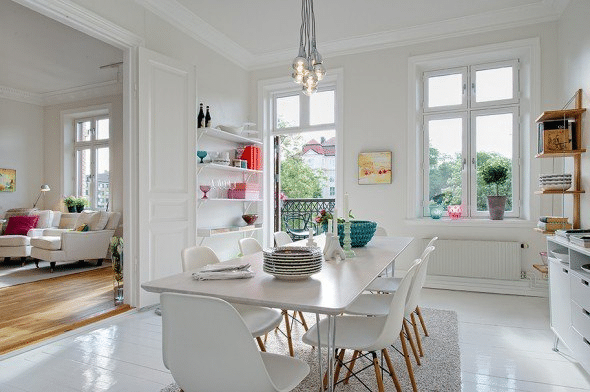
As many interior designers will tell you, the first step toward minimalism is to take a look around your home or office. Look at all of the furniture, artwork and accessories. Does everything need to be there or can you do away with it? A lot of our clients are turning to minimalist décor as a refreshing way of living and working where both become neat, organized and clutter-free.
The minimalist decorating style is an exercise in restraint, where space, lighting and objets d’art play equally important roles. This style demands you pare down your furnishings to the bare essentials so that you are left with a set of curated objects that deliver maximum impact. Far from being boring, this style is bold, functional and memorable.
TIP #1 – DECLUTTER AND EDIT
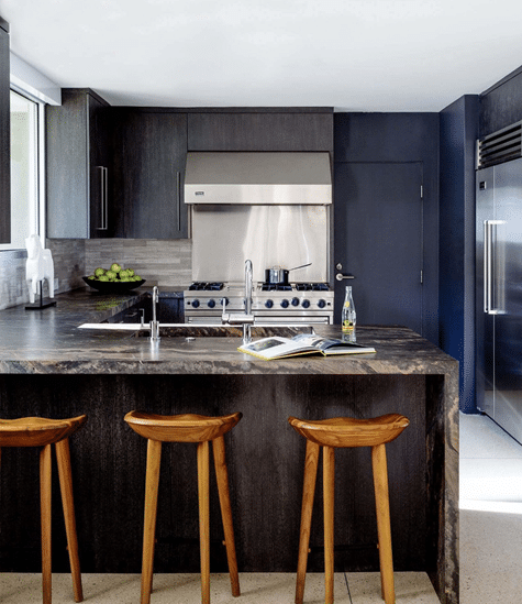
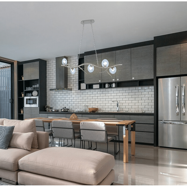
Say goodbye to clutter – you’ll be glad you did! You’ll have to edit what you display on shelves and tables. Stick only to the essential and store the rest away. This kitchen shows how only a few well-chosen elements have made it to the counters. Also, the choice of a neutral grey kitchen with a pop of blue gives the space a rich feel and is designed tonally, which is my favorite way to design!
TIP #2 – EMPTY SPACES AND FOCAL POINTS
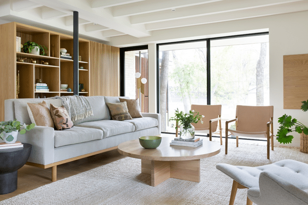
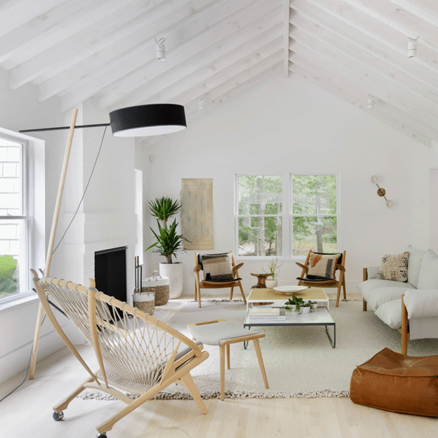
Empty space is considered an important element in minimalist decor since space interacts with the objects and defines the look. Visual balance is just as important and can be achieved only by having a focal point. Notice how the living room has plenty of empty space and no unwanted distraction. At the same time, some of the family’s favorite decor does find a spot in various places in the room.
TIP #3 – USE ACCENT PIECES
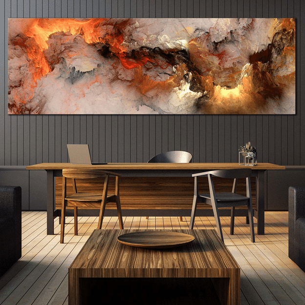
Designing a minimalist home doesn’t mean you need to avoid decorations and bright colors. The rule is to simply use decorative elements as accents and not overwhelm your home with a lot of things. Similarly, for art, choose one focal piece instead of a group of small ones. In this office, the artwork against a bare wall becomes a focal point and not a cluttered distraction.
TIP #4 – CLEAN LINES AND FLAT SURFACES
Furniture and objects in a minimalist home feature clean, defined lines and curves as well as flat surfaces. This kitchen has well-defined cabinets, drawers and windows and lots of flat surfaces. The clean lines given by lack of handles on the cabinets are also soothing to the eye!
TIP #5 – PLAY WITH TEXTURES
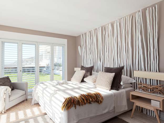
You can make things interesting by trying different textures. In this bedroom, a “headboard” has been created from tall reeds painted white which adds a lot of interest in the room. The pillows are a combination of velvet and a raised dot print. The throw on the bed has an exaggerated trim edge detail giving the room a refreshing appeal. While different textures have been combined, this room decor is in no way overwhelming.
TIP #6 – LET IN THE LIGHT
Bare windows are your friend. If you can leave your windows unadorned and let the light pour in, it would significantly add to the minimalist style. If privacy is an issue, use the thinnest curtain materials or use blinds. In this living room, sheer curtains would still let in a lot of sunlight, brightening everything in its path. Less certainly is more!
TIP #7 – PATTERNS FIND A PLACE
Minimalist homes usually use a limited amount of patterns or opt to do away with them all together. If you decide to go with patterns, use them on a small scale, tone-on-tone or in unobtrusive patterns. When it comes to prints, use them the way you would an accent piece. Choose prints for the curtains or your throw pillows. Also, you can never go wrong with a patterned carpet that centers the room. It gives the room a much-needed break from monotony.
TIP #8 – USE A RESTRAINED COLOR PALETTE
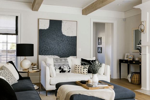
Light colors such as white along with understated neutrals, barely-there greys, and pastels are intrinsic to minimalist homes. Though you could add brighter colors, we suggest you stick to one or two and limit the dosage. The picture below uses mostly white to create a well-lit room. Even the white quartz dinner table here enhances the minimalist style. Colors are added in subtle ways around the room.
