
When it comes to redesigning a room, the first decision can sometimes be determining what color you would like to use. Color choice can be inspired by a fabric or a rug. It can also be inspired by a painting or a collection of pottery, for example. I’ve worked with some clients who love to blend different colors and patterns but there are others who have a more subdued and calming vision of what they’d like to see in their personal space. In the second instance, a monochromatic scheme is the way to go.
Monochromatic does not necessarily mean just one color. Boring!!! It is true that enveloping a room in one color creates a blank canvas but colors are used most successfully when there is similarity in hue within the room itself and from one room to the next. Using different shades of the same hue creates depth in a room. For example, darker and lighter shades of a warm grey are used in the room pictured below and it makes for a fabulously luxe feel adding much more interest than a totally grey room using only one grey color.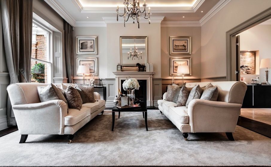
So we start with one basic color and then create a range of hues by playing with the various tones, shades and tints that can be created from the original. In most instances, this is more easily said than done so contacting an interior designer is a good idea. Once you have collaborated with a professional on a plan, you can work on your own to implement it as your budget permits.
Since monochromatic designs equate to inducing a more relaxed mood, this color palette is often utilized in spaces like bedrooms or bathrooms where a spa-like feel is desired. Other great applications might include a child’s playroom to help keep all that energy at bay, a home office where a Zen-like feel is the goal or a personal getaway space where you can kick back without much around to stimulate your brain. Glass o’ wine, anyone?
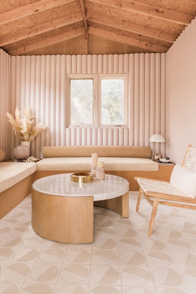
You may still feel a bit of trepidation around the words “monochromatic design”. Perhaps you’re picturing a room where the sofas blend into the walls and every element of the room is the exact same shade. Since the shades in your interior will tend to blend together, texture and pattern are the easiest ways to add visual interest. In fact, while too many patterns are usually a design no-no, in a monochromatic scheme you can layer in a number of different patterns and textures with a very positive result.
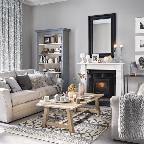
Monochromatic design does take a bit of know-how to pull off correctly, however. You must ensure that the undertones of the hues you select work together. A cool grey and a warm grey do not work well when placed side-by-side. A yellow spring green and a green with a bluer tint will look ill-matched so again, consulting an interior designer is a good first step.
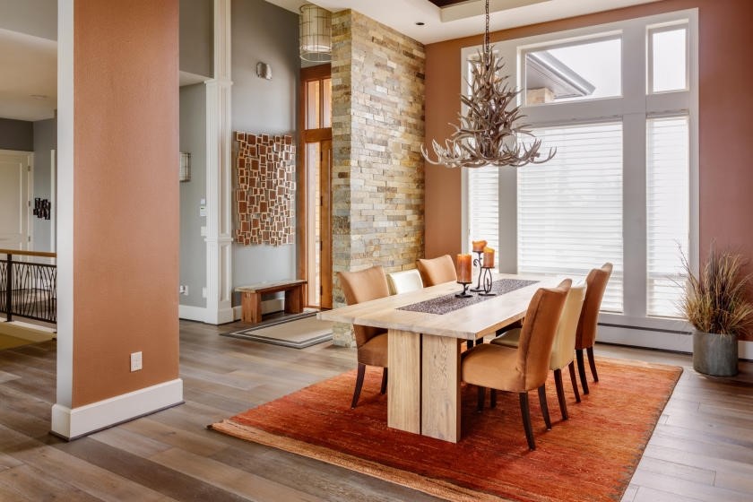
Neutrals are an important calming factor that direct our attention to strong use of color elsewhere. In the picture below, the more saturated but still subdued color in the dining room is highlighted by the neutral wall color everywhere else. This is also a perfect example of our prior point regarding paying attention to the undertones of the colors you select – the terracotta used on the dining room walls is a dulled-out, more grey copper. It is does not have a pink or an orange base and for this reason, it blends properly with the grey walls in the rest of the home. The brick wall serves as an element that “marries” the dining room wall color with the greys from the entry walls and floors with the stained wood door frame and the dining room chair fabric.
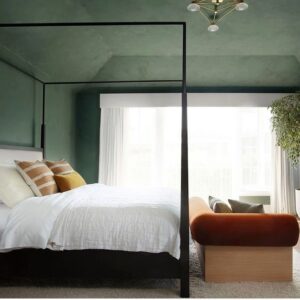
One caveat: When there is no crown molding in the room, remember to paint the ceiling a different color.
BORING
NOT…

Single color spaces are often the subject of heated debates. Some think they’re too simple to be worthwhile. When done correctly, however, we can attest that they are the epitome of easy elegance with an abundance of calm sophistication.